
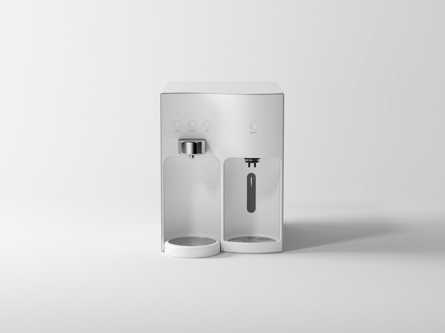
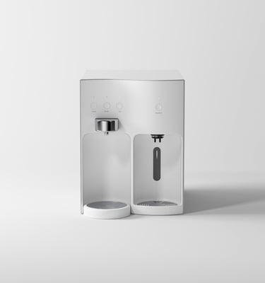
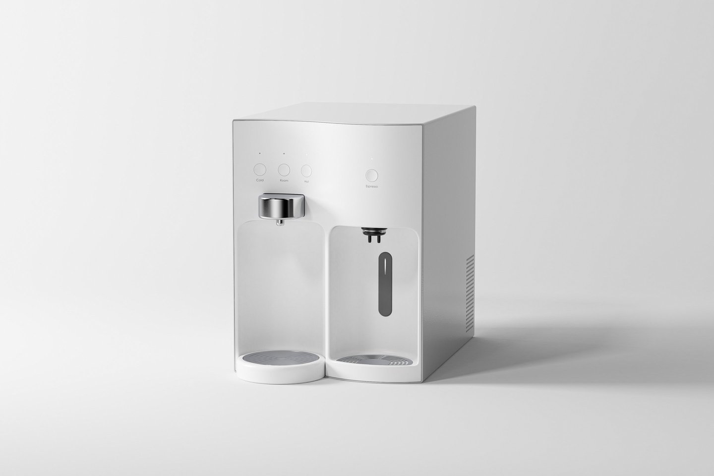
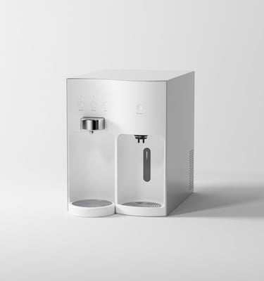
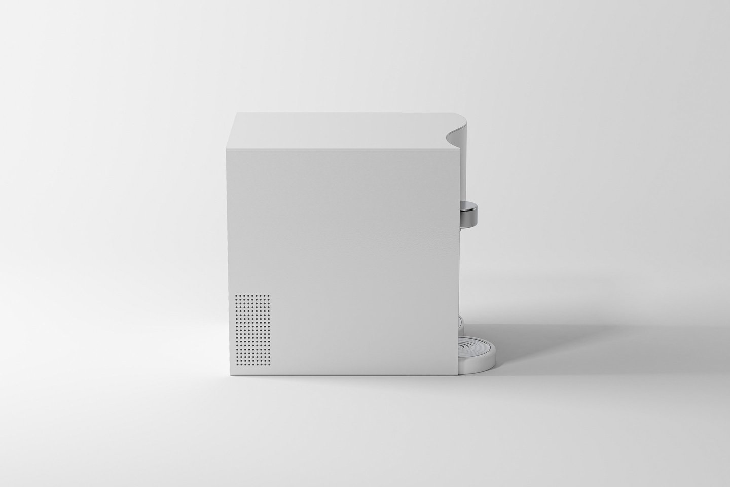
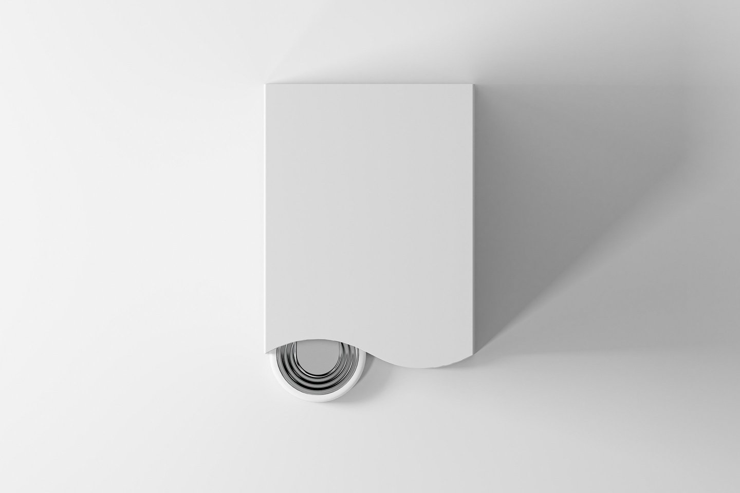
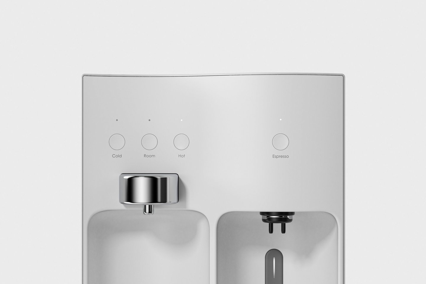
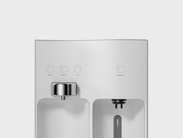
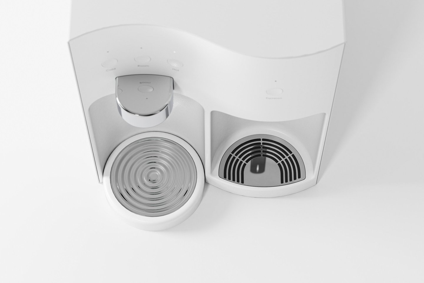
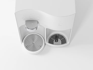
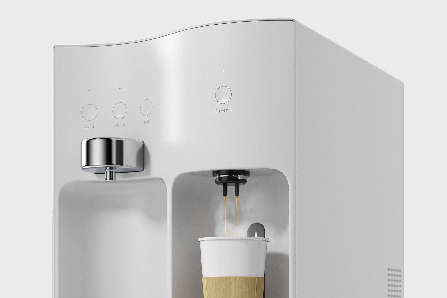
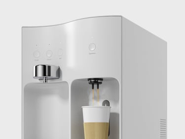
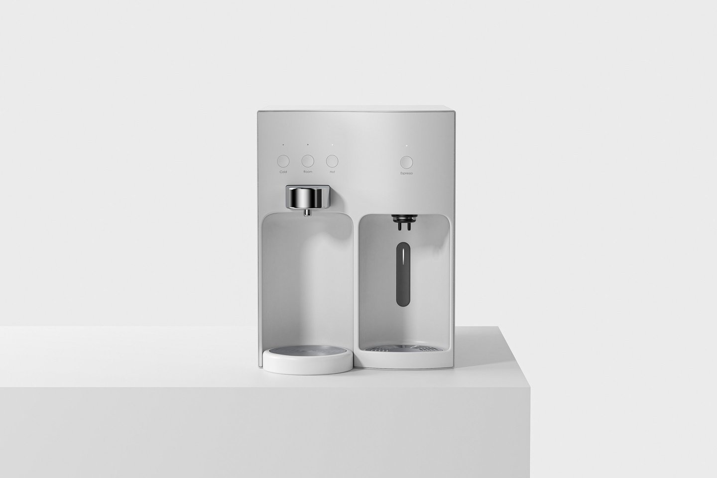
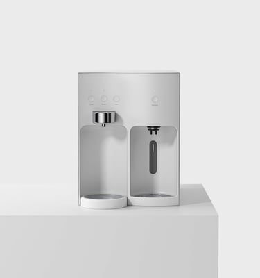
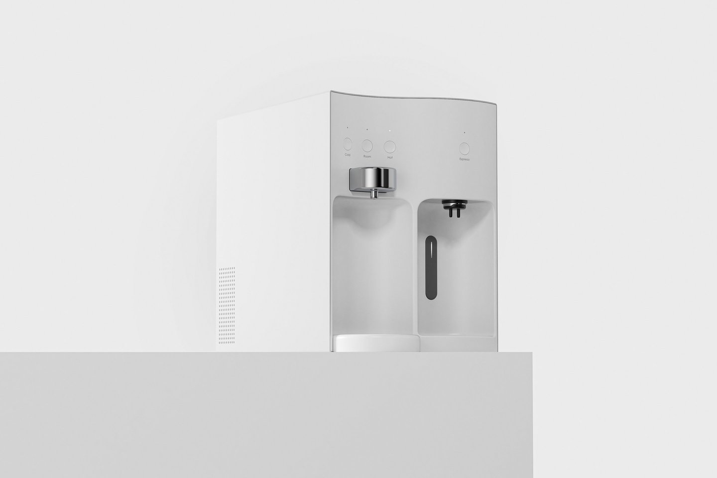
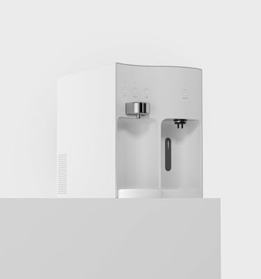
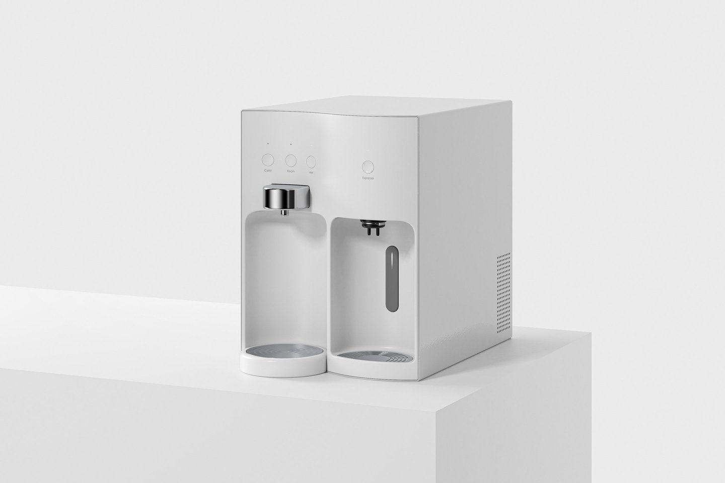
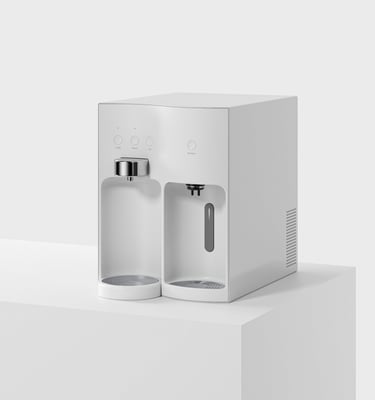
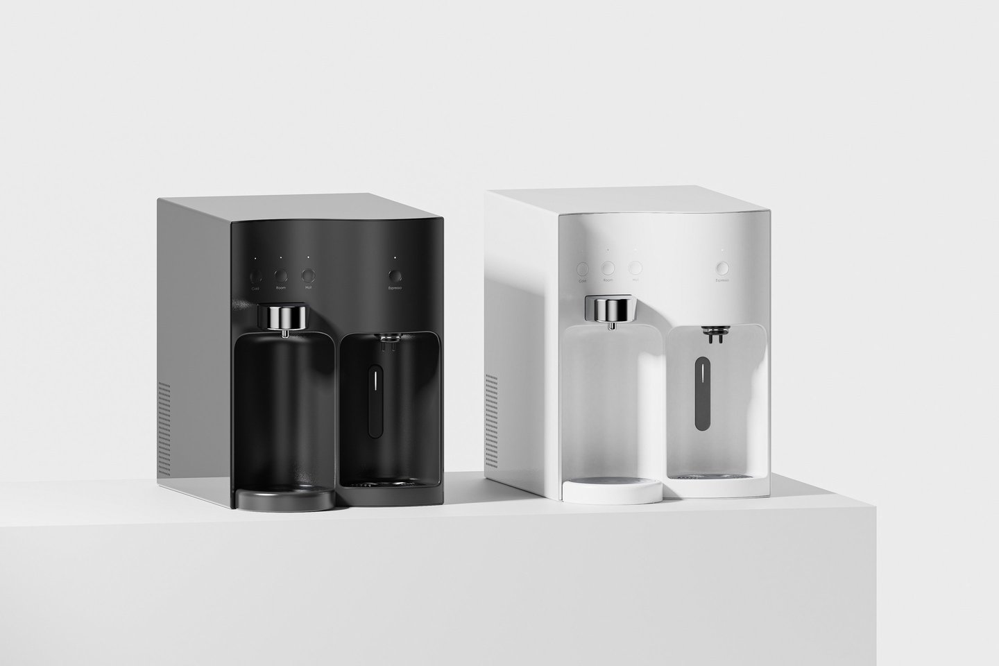
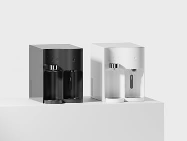
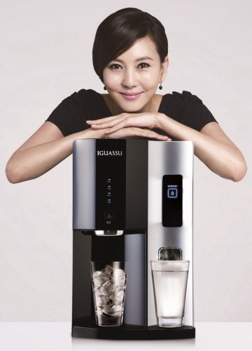
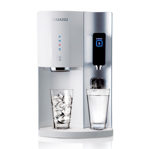
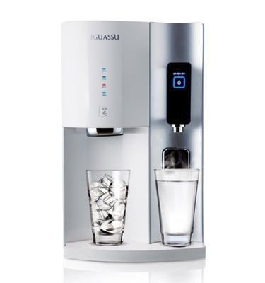
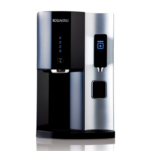
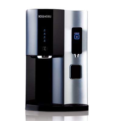
The client approached us at a pivotal moment, ahead of developing a new water purifier lineup, seeking more than a conventional design solution. Their request was twofold: to establish a distinctive visual character that could define the new lineup at a glance, and to explore, as a forward-looking possibility, what additional functions beyond water purification could meaningfully expand the product’s role in everyday life. Our response centered on a clear conceptual keyword — “two functions.” Translating this idea into form, we introduced an S-shaped character applied to the product’s front surface. This single, continuous gesture allows the two functions to be intuitively perceived as distinct yet seamlessly connected. By extending this bold line across the entire front facade, the character becomes not merely a decorative element, but the core identity of the product itself. The result is a strong, recognizable visual language that naturally communicates functionality while setting the lineup apart from competing products. Through restraint, clarity, and confident form-making, the design balances emotional appeal with strategic intent, offering a scalable visual system for the brand’s future evolution.
Wave
Client
Year
Category
Desktop Water Purifier
Chungho Nais
2011
Visual Language
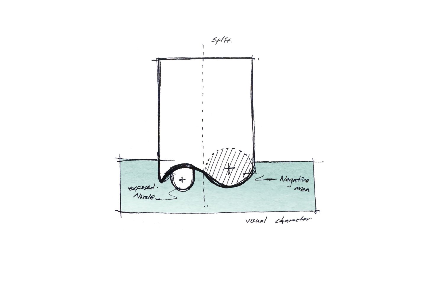
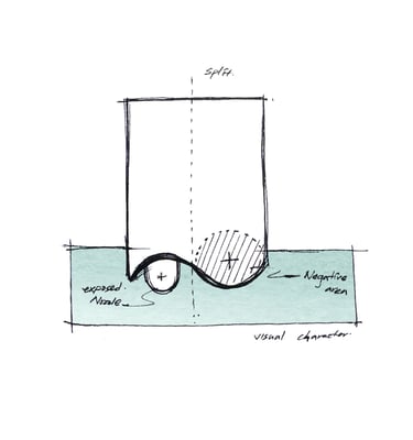
Early Ideation Sketch
Implemented in a mass-production model

Tiny
© Jaewan Park Design. All rights reserved.
Jaewan Park Independent Creative Consultant